
Kitchen colours and finishes for 2027
Warm neutrals, greens, two-tone units, wood grain and matt finishes are the looks coming through now. What is changing, and how to choose a colour you will still like for years.
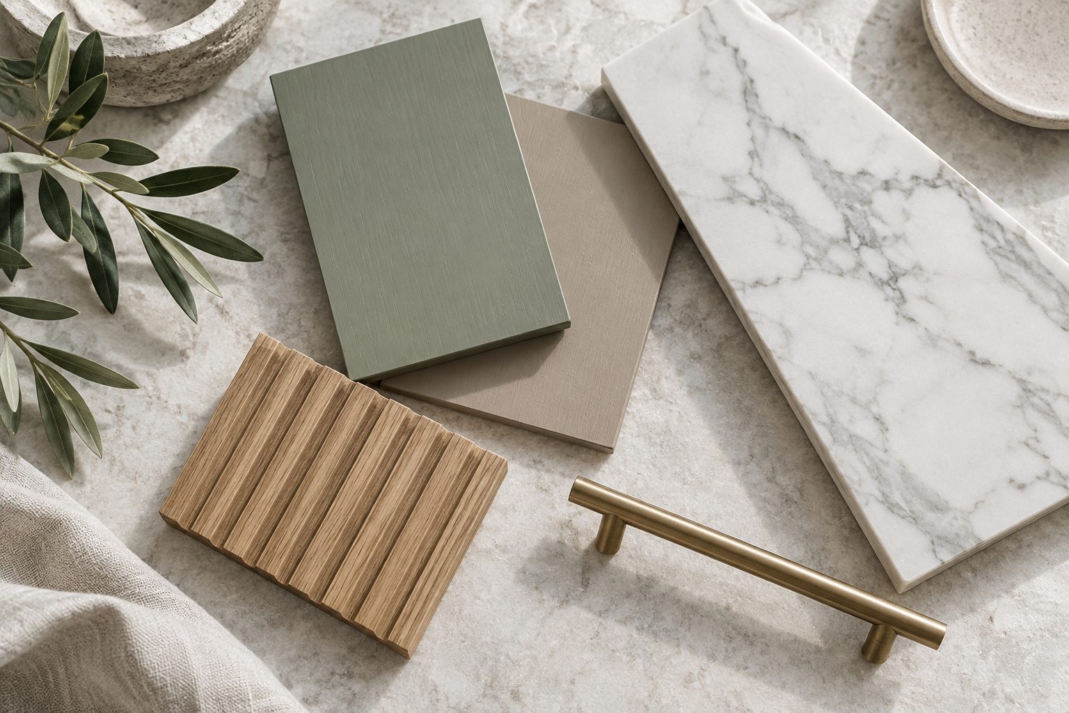
Grey has had a long run. For years it was the safe choice for kitchen doors, and plenty of kitchens around Milton Keynes still wear it well. But the colours and finishes coming through now are warmer, softer and more varied. Here is what is changing, and how to use it without choosing something you will tire of.
Warm neutrals are taking over from cool grey
The new neutrals have a little warmth in them: mushroom, taupe, warm greige, soft stone and creamy off-white. They feel calmer than cool grey and sit more easily beside wooden floors, oak furniture and the living space that so many kitchens now open into.
If you like the idea of a neutral kitchen but find white too stark, this is the place to look. Warm neutrals are also more forgiving. They show less of the everyday splash and smudge than bright white, and they suit both a classic shaker door and a plain flat one.
Greens and muted blues
Green is still the colour people ask about most. Sage is the gentle starting point, olive is a little earthier, and deep forest green is for those who want the kitchen to feel rich and cosy. Muted blues, from soft blue-grey to navy, come next.
Deep colours carry a lot of weight, so they work best low down. Put a dark green or navy on the base units or the island, keep the wall units lighter, and the room keeps its sense of space.
Two-tone kitchens
Two colours in one kitchen is now normal rather than daring. The usual combinations are:
- darker base units with lighter wall units, which suits smaller kitchens because the eye is drawn upwards
- a lighter run of units around the walls with a darker island as the anchor
- sage green with warm grey, navy with light stone, or deep blue with natural oak
The trick is to choose one colour as the lead and let the other support it. Two strong colours fighting for attention rarely works.
Wood grain is back
After years of painted and plain finishes, wood is back as a cabinet finish in its own right. Natural oak leads, and darker woods such as walnut are returning too. The look has moved on from the orange honey oak of older kitchens: today's woods are either pale and matt or deep and rich.
You do not have to match every timber. Painted units with a wood island, or wood-effect base units with painted wall units, both look current. If you are unsure, keep wood to the island or the lower run so the room does not feel heavy.
Slimmer shaker frames
Shaker doors are not going anywhere, but the frame is getting narrower. A slim shaker door sits between the traditional framed door and the flat slab. It has a little detail and shadow without looking country, so it suits people who want something classic that still feels fresh.
Handleless kitchens remain popular, especially with integrated appliances, but they are now more often paired with wood and texture than with high gloss.
Matt over gloss
Matt and soft-touch finishes have overtaken gloss on doors, worktops and splashbacks. Matt looks calmer and shows fingerprints less, although it is worth asking how each finish should be cleaned before you choose. Gloss is no longer the default.
The worktop as the feature
Worktops are doing more of the talking. Marble effects with bold, warm veining are the main look, and concrete effects suit a plainer, more seamless kitchen.
If you choose a strongly patterned worktop, keep the doors simple so the pattern can be seen. A single busy surface is striking. Add a second and they compete.
Full-height splashbacks
Splashbacks are getting taller. Rather than a short upstand and a painted wall, many kitchens now run the splashback all the way up to the wall units, often in the same look as the worktop so the two read as one surface. Glass panels and small tiles are popular, and tinted or antique-effect mirror is taking over from clear mirror for those who want a little sparkle.
Warm metal handles
Chrome is giving way to brushed brass, antique brass and copper tones. They bring warmth to green, blue and neutral doors alike. The old rule that every metal in the kitchen must match is fading too, so a brass handle beside a steel tap is fine as long as it looks deliberate. Push-to-open doors make handles optional altogether.
How to choose a colour you will still like
A few habits help you avoid a costly mistake:
- Test it against your floor. Hold a sample against your floor and worktop, not just a white wall. The floor usually stays, so the doors need to sit well with it.
- Look at it in evening light. Many of us use the kitchen most after dark, under artificial light, and warm neutrals and greens can look quite different then.
- Keep deep colours low. Dark base units with lighter wall units are easy to live with. Dark everywhere can feel closed in.
- Let one surface be the bold one. A bold worktop, a bold door colour or a bold splashback. Pick one.
- Follow trends in the small things. Choose a door colour you love, and have fun with the parts that are easier to change, such as handles, lighting and accessories.
Trying a new colour without a new kitchen
If your units are sound, you can change the whole look of your kitchen by replacing the doors and worktops, which saves you replacing the whole kitchen. You can try door colours and worktops together on our example kitchen, and when you are ready, book a free home visit for a no-obligation quote.
